The maps that are part of your dynamic visualization have a lot of features that can help you! Let's get an overview.
A dynamic visualization or Kepler Map is an interactive map of your data, for you to discover and share. Your dynamic visualization was created to provide strategic insights into your destination.
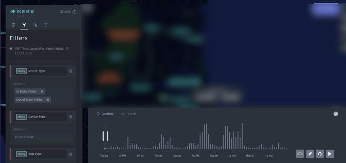
In this map, individual dots on the map signify each device/person moving throughout your destination during a given timeframe. If you hover over a dot, you will get more information about it.
Toolbar
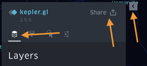 You can use the tools to filter your data or change the display to light/dark or satellite.
Share your map with others
You can export images, data, and maps by clicking the "Share" button.
You can hide the toolbar by selecting the arrow.
This is helpful if you are presenting your map.
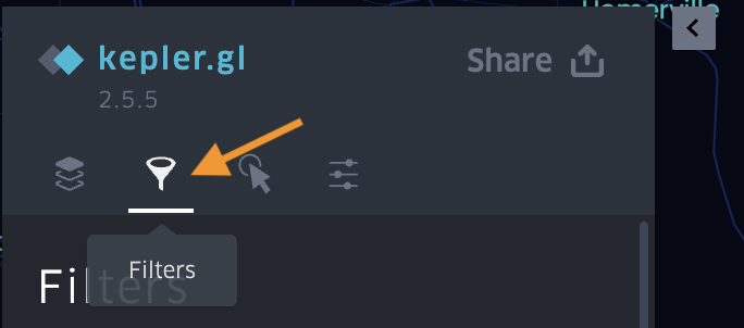 You can use this section to look at what default filters it is set to display, and to change the filters based on what you want to see.
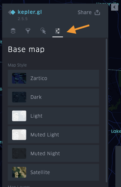 This section contains options for how your map will display, such as dark, light, or satellite.
Pro tip: If you hide this bar and want to bring it back, click refresh on your web browser.
These are the filters.
You can use this section to look at what default filters it is set to display, and to change the filters based on what you want to see.
Pro tip: If you want to change back to the defaults, refresh this webpage.
Map Style
This section contains options for how your map will display, such as dark, light, or satellite.This is the time-lapse window and time-lapse display.
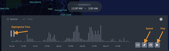 Your map displays data from a certain timeframe, displayed here.
The highlighted section of the time-lapse display shows what time corresponds to the data displayed.
 Clicking this will display what the different colors of data represent.
Pro tip: You can decrease the highlighted section to see a smaller increment of time, which is helpful when watching the time-lapse run.
Use the play button.
To make the time lapse run through the entire time frame, click the play button.
You can adjust the speed.
Use this button and then use the slider bar to make the time lapse play faster or slower.
You can minimize the time lapse display.
Click here to hide the time lapse display. To bring it back, refresh the page.
This is the legend.
Watch a walkthrough of a kepler map:
Curious to understand more about dynamic visualizations? Check out this article!