Modules and charts follow a pattern to help you effortlessly locate the insights that matter most
Let’s get you started in the Zartico Destination Operating System (ZDOS) for airports! By now you should have been sent an activation email from Zartico@zartico.com. If you didn’t receive the email yet, click here to find out how You will need to set up your account and password to access your airport's information within the application.
What are the most important things to do first within the Zartico OS?
- Familiarize yourself with navigating the modules and charts so you can quickly locate your insights.
- Play with the Filters to learn how to adjust the data you see.
- Dig into the charts
- Learn the color codes
Modules
The modules in ZDOS are designed to help you effortlessly locate the insights that matter most. You can find these modules on the left-hand side of your screen.
These modules include:
State of your Airport: This module shows a high-level overview of your passengers and your market share.
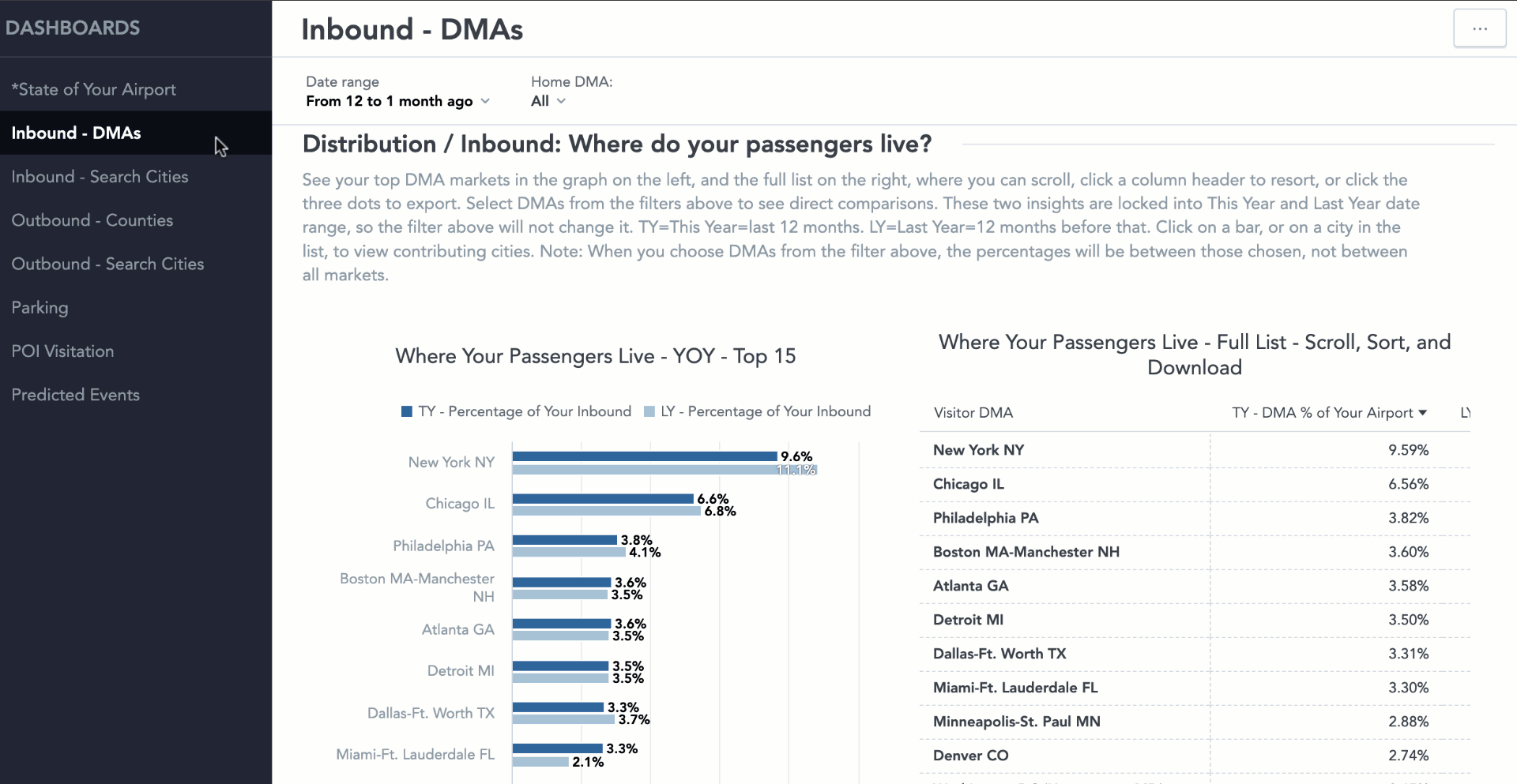
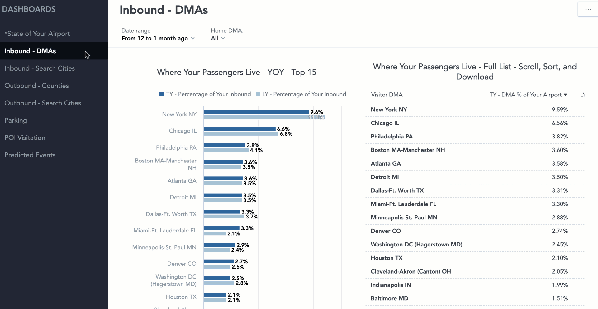
Inbound - DMAs: This module shows you the DMAs you draw from, the overall size of each DMA, and the market share of those DMAs between you and your competitors.
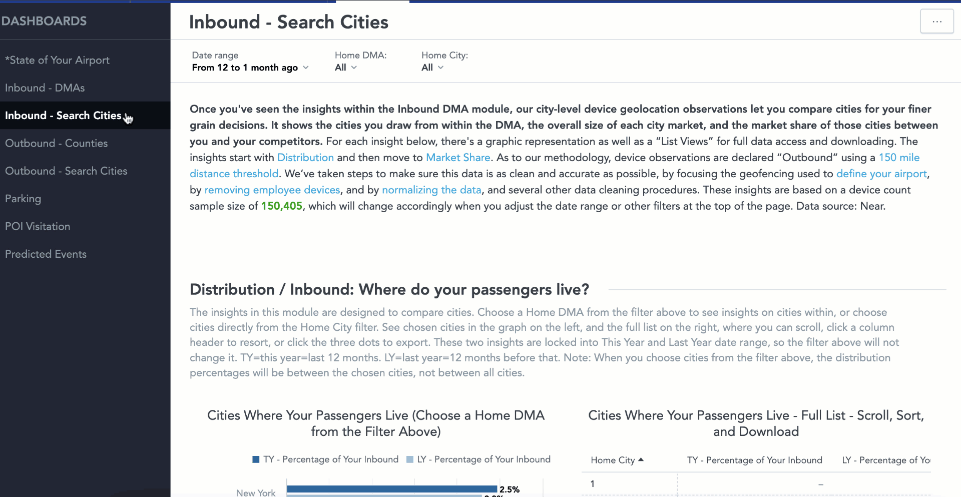
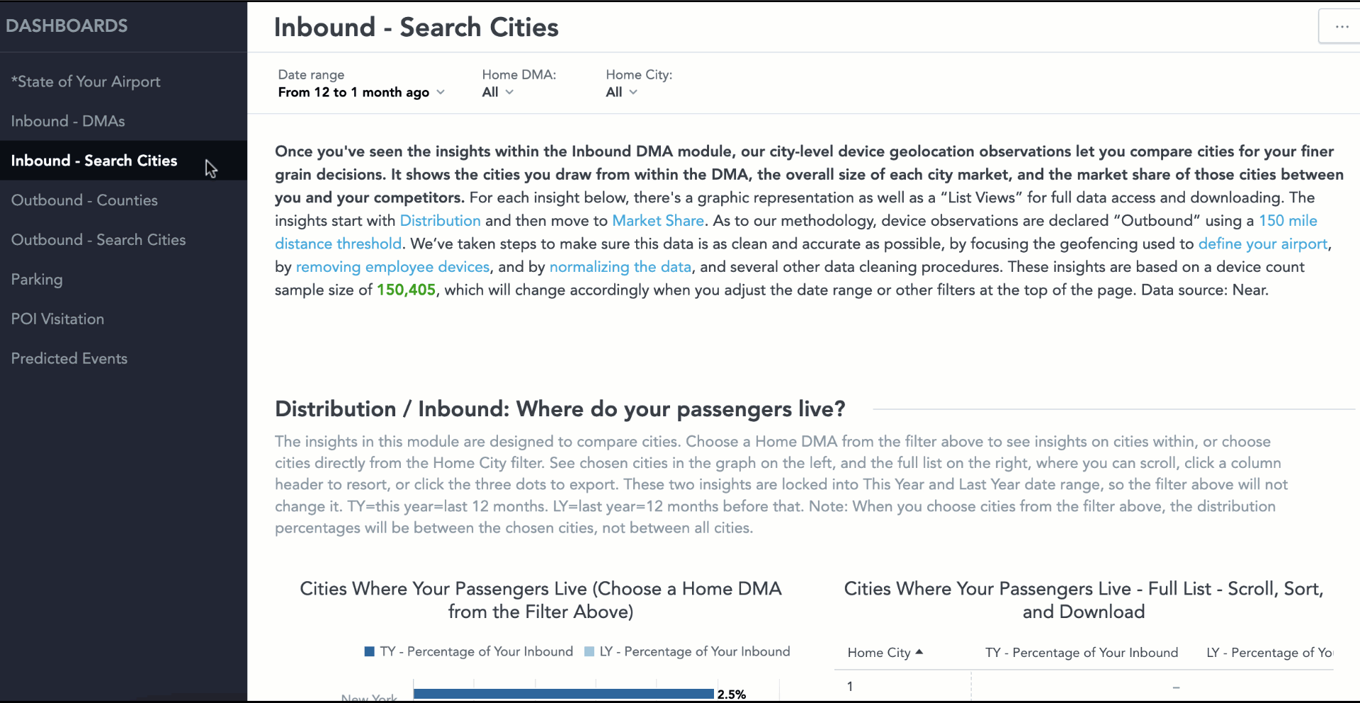
Inbound - Search Cities: Once you've seen the insights within the Inbound DMA module, our city-level device geolocation observations let you compare cities for your finer-grain decisions. It shows the cities you draw from within the DMA, the overall size of each city market, and the market share of those cities between you and your competitors.
Outbound - Counties: This module shows you the counties you draw from, the overall size of each county market, and the market share of those counties between you and your competitors.
Outbound - Search Cities: Once you've seen the insights within the Outbound County module, our city-level device geolocation observations let you compare cities within your Counties for your finer grain decisions. It shows the cities you draw from, the overall size of each city market, and the market share of those cities between you and your competitors.
Parking: This module shows you where your economy/long-term parkers live, where parkers at off-site lots live, and the parking market share of counties and cities in your catchment.
POI Visitation (Standard and Enterprise only): This module gives insight into the POIs passengers visit after passing through an airport, and which airport has the largest visitation share of each POI.
Predicted Events: This module gives insight into the predicted events and venues in your market most likely to impact air travel.
Module Structure
The modules are designed so you can quickly find the insights that matter most. To aid in this, each module is structured in a specific way. The sequence of insights for each modules is as follows:
-
Distribution - Where your passengers live
-
Year over year (YOY) Distribution - Change from last year to this year of where your passengers live
-
Market share - Percentage of passengers in your catchment area and surround use your airport.
-
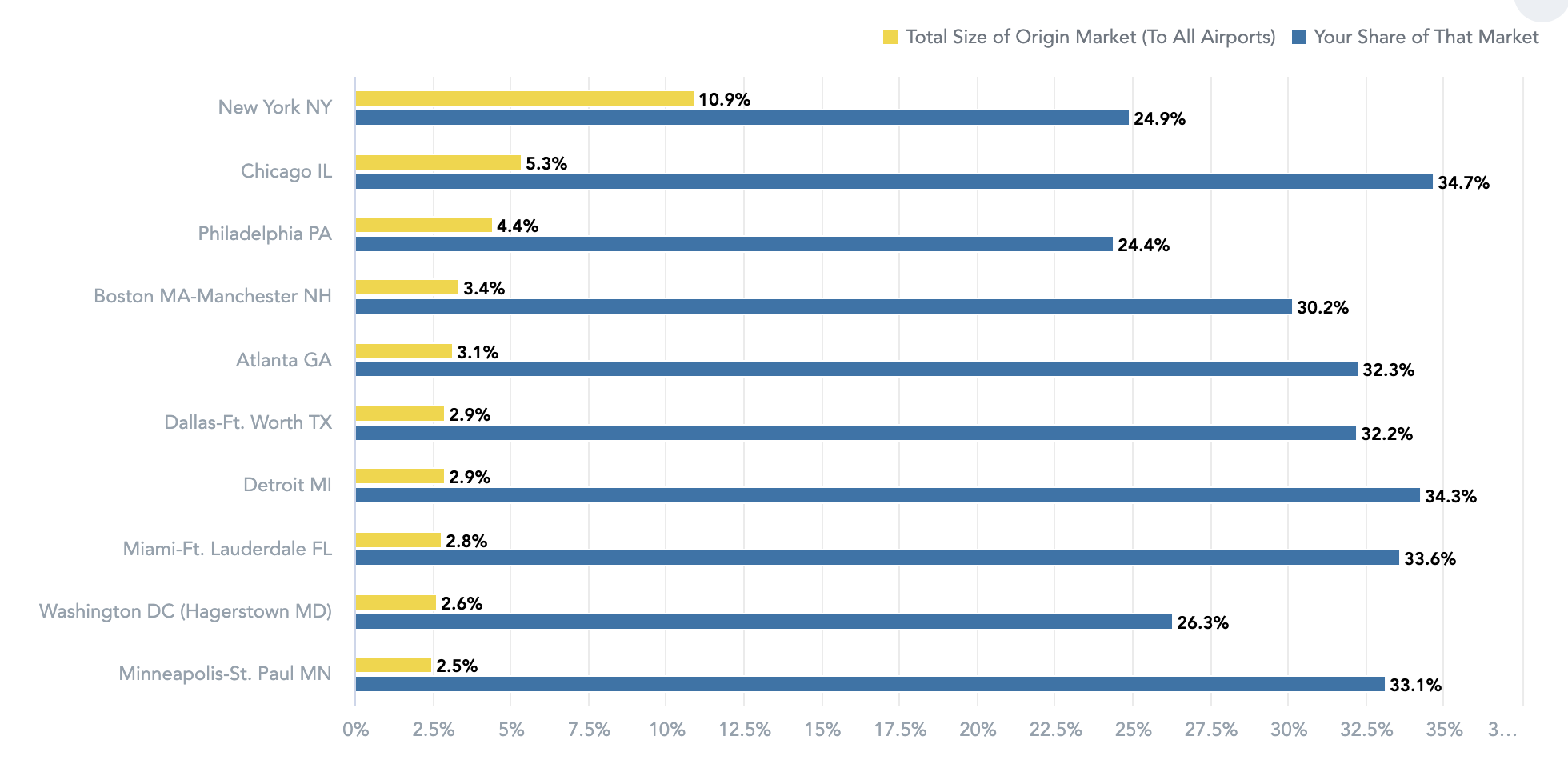
Total market to all airports - How much of the top origin markets to your region are you capturing?
Filters
Every module includes a set of filters to customize the information you see.
Filtering One option - You can quickly make an individual selection by clicking "only" on the right and then clicking "apply".
Filtering many options to compare - To compare multiple cities, simply deselect all and choose the cities you wish to compare before clicking "apply".
Cascading filters - Filters will update and cascade options based on other selections you have made. For example, if you select Chicago as the Home DMA, only cities within the Chicago DMA will then show up in the Home City filter.
Digging into Charts
Charts contain much more information than what meets the eye. So we encourage you to dig in and maximize the information you can glean from these insights.
At first glance, the visual charts will show only the top results for the question being answered. Filters are a great way to initially adjust the visual charts.
Sorting and Downloading results - Each chart includes both a visual version and a spreadsheet version of the data. The bar graph will show you top results and the spreadsheet will show you the full results. You can sort the chart within ZDOS or download the results to XLSX or CSV.
Click charts to drill in - To gain deeper insights into the data, you can click on a chart to explore further. As you hover over a chart, a pop-up will appear with the message "Click chart to drill". Click on the bar that you want to explore in more detail. For example, if you're examining a DMA, you can click on the chart to see a breakdown of the cities within that DMA.
Color Codes
Our use of colors in these modules is intentional and designed to help you easily interpret the information presented. Here is a breakdown of how we use colors to enhance your understanding.
- Blue is always your airport.
- Competitor airports maintain a consistent color throughout all insights.
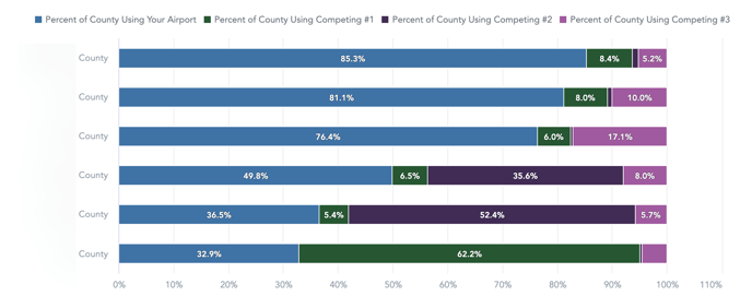
- Yellow will always represent the overall total of all airports for the insight shown.