Do you use Analyze? Here are detailed instructions for how to customize your charts!
Quick Reference:- How to Rename Measures
- How to Change the Format of Measures
- How to Customize the Axes of your Graph
- How to Move Measure to Show on Right Axis
- How to Hide or Change Location of the Legend
- How to Show or Hide Data Labels and Gridlines
- How to Change the Colors in your Insight Graph
- How to Filter a Measure to Only Display the Top or Bottom Attributes
- How to Exclude Measure Values Based on a Set Numeric Criteria
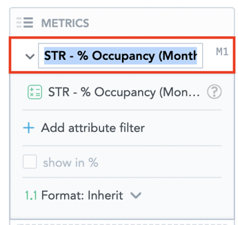
How to Rename Measures:
- Once you drag a measure from the data catalog into the Metrics section, you can customize the measure name.
- To customize the name, click into the current measure name as shown in the red box below. From there, you can rename the measure based on your preference. For example, instead of “STR - % Occupancy (Monthly)” you can change the measure name to “STR Occupancy.”
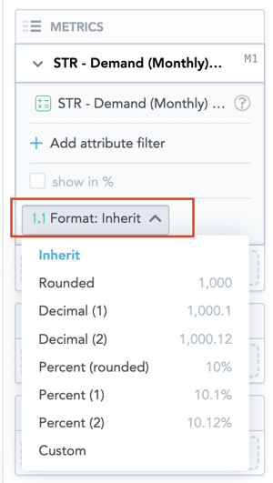
How to Change the Format of Measures:
- Once you drag a measure from the data catalog into the Metrics section, you can customize the format of the measure.
- To the left of the measure name, click the caret icon to expand the section.
- In the expanded section, click the “Format” button. Within the dropdown, there are standard formats.
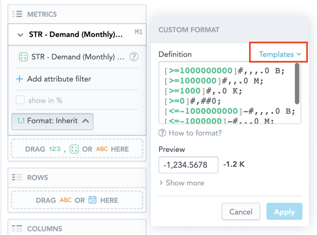
- If your preferred format is not included in this list, click “custom.”
- In that popup window, you can define your own format or click “templates” to view an expanded list of predefined formats. For example, if you are displaying tax revenue or STR demand, you might want to select the “currency shortened” format for revenue or the “large numbers shortened” format for demand.
- Tip: Hover your mouse over the question mark on the right side of the template name to display examples of the formatting.
- Click “Apply.” The insight now displays the numbers in your selected format.
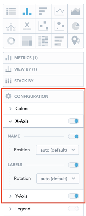
How to Customize the Axes of your Graph:
- Click to open the Configuration section.
- To hide or display axes, toggle the switch for the X-axes and Y-axes.
- To change the axis values display angle, select the angle in the Rotation dropdown list.
- To hide or display the axis name, toggle the switch for Name.
- To change the axis name position, select an option in the Position dropdown list.
- To set the minimum and maximum values for an axis, type the values in the Min and Max fields.
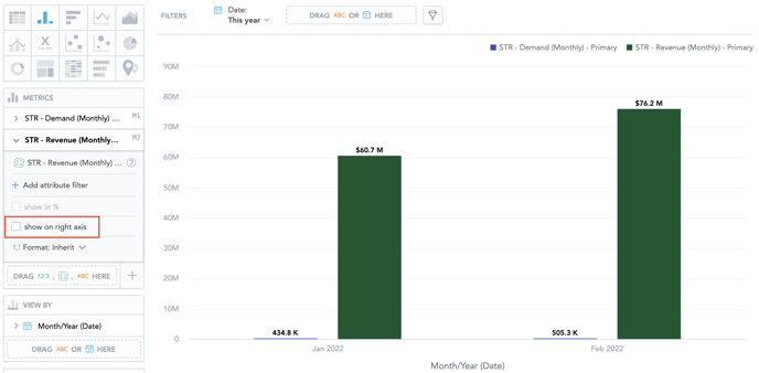
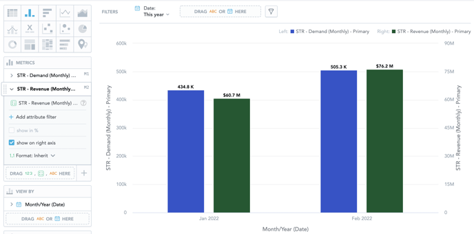
How to Move Measure to Show on Right Axis:
When comparing two metrics with vastly different values, it can be beneficial to show one of the measures on a secondary axis. For example, if you are comparing STR demand and revenue the bar chart or line graph is much easier to read if one of the measures is displayed on a secondary axis.
- Drag the desired measures from the data catalog into the Metrics section, you can customize the format of the measure.
- To the left of the measure name you wish to move to the secondary axis, click the caret icon to expand the section.
- Select the show on right axis checkbox in a measure’s settings.
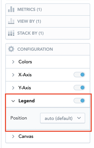
How to Hide or Change Location of the Legend:
- Click to open the Configuration section.
- To hide or display the legend, toggle the switch in the Legend section header.
- To change the position of the legend, select the position in the dropdown list.
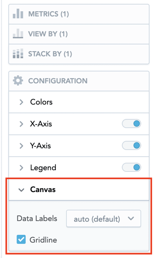
How to Show or Hide Data Labels and Gridlines:
- Click to open the Configuration section.
- To show or hide the data labels, select the option in the Data Labels dropdown list.
- To show or hide the gridline, select or unselect the Gridline option.
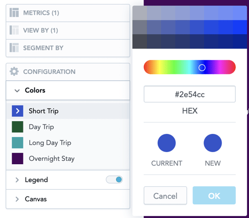
How to Change the Colors in your Insight Graph:
For each of the measure/attribute in your insight, you can change the color in which the insight graph displays it. For example, you want to display your visitation in your brand colors rather than the default blue in the Zartico Operating System.
- In the Configuration section, click Colors.
- Click the color of the measure/attribute that you want to change.
- Select a new color, or click Custom color to adjust the current color.
- You can select another color from the picker, enter a hexadecimal code for a new color, or select a different shade of your color.
- To revert to the original colors, go to Configuration → Colors and click Reset colors.
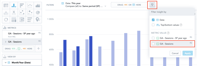
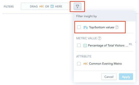
How to Filter a Measure to Only Display the Top or Bottom Attributes:
Are you creating an insight graph and receiving the error “too many data points to display?” Or are you trying to look at your top origin market or top visited points of interest? The Top/Bottom Values insight filter can help display this data in a more valuable way.
- Once you drag a measure from the data catalog into the Metrics section, you can filter the measure to only show a certain number of attributes.
- Click the filter bar dropdown icon.
- Select Top/bottom values.
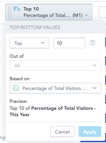
- Click Apply. The filter is added to the filter bar. The default setting is top 10 values out of all attributes based on the first measure in the insight.
- Click the filter in the filter bar.
- Select if you want to see top or bottom values and specify a number. You can select the number from the dropdown menu or write your own.
- If you have multiple metrics in the insight graph, you will need to specify which one you want to filter. In Out of, select the attribute whose values will be filtered. You can select one attribute or All attributes (if your insight includes multiple attributes).
- In Based on, select a measure to use for filtering.
- Click Apply.
Note: If you display a measure in percent (the Show in % option is selected for the measure), the ranking filter disables this option.
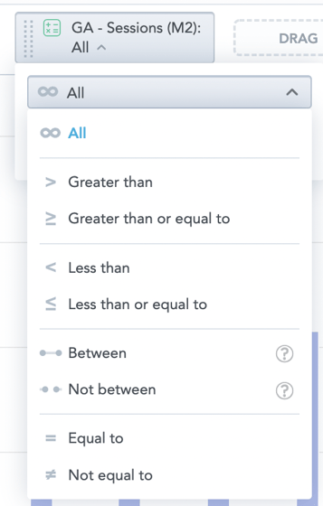
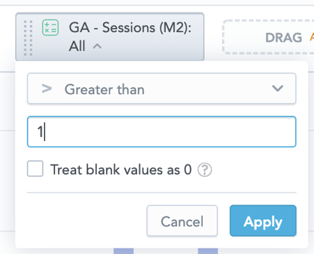
How to Exclude Measure Values Based on a Set Numeric Criteria:
You can filter data by values of the measures used in your insight. For example, you can display data that correspond to a specific measure value, fall within or outside of a certain interval, or are greater than the specified value.
- In the insight graph you want to filter, click the filter bar dropdown icon.
- In the Measure value section, select the measure you want to use for filtering and click Apply. The measure is then added to the filter bar.
- Click the measure in the filter bar and select one of the logical operators. Specify the values for filtering and click Apply.