Learn how to interpret the charts and insights within your ZDOS
There are a variety of charts that display your data. Each chart is carefully designed to display your data in a simple and clear visual. Below are the different types of you may find and how you can interpret the data displayed within them.
Bar Chart
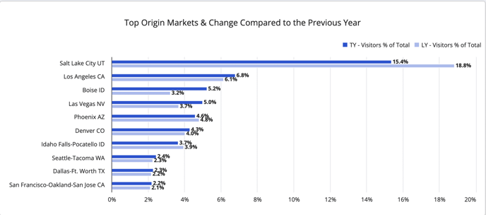
Bar charts show you results in horizontal bars.
In a bar chart, each bar represents a number. The number on the bar should be read through the filters that are set.
The bars visually show the numerical result of the top results on the Y-Axis.
Column Chart
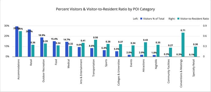 Column charts show you results in vertical bars.
In the column chart, each bar represents a number. The number on the bar should be read through the filters that are set.
The bars visually show the numerical result of the top results along the X-Axis.
Bubble Charts
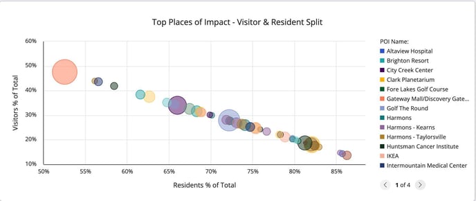 Bubble charts show you the relationship between three things at once.
Bubble charts show data points as bubbles using X and Y coordinates. In addition, bubble charts can display the size of the bubbles in proportions using a third measure. This is why we like to say you can see your data in 3D in Bubble charts!
First, the size of the bubble will indicate the amount of total observations relative to other results, meaning the larger the circle, the more total observations are counted.
Second, the position of the bubble on the chart coordinates with the element on the x-axis and y-axis.
Chart Features
Click to Drill
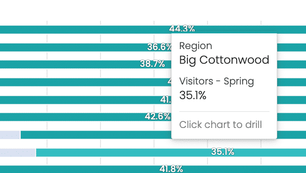 You will often see a pop-up when you hover over a chart. You can click on an element of the chart and it will show you more detail of the data point you are seeing.
Legends
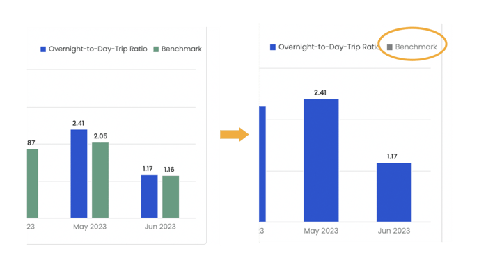 Legends are responsive. If you want to filter out certain elements of your chart your can toggle on and off those elements from the legend. Click on the colors box in the legend to toggle them on and off.
Sliders
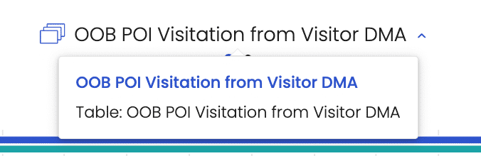 If you see several dots underneath the title of the chart, this tells you that there are multiple views available. As you hover, you will see a layer icon and a carrot on the title of the chart. You can toggle between chart types by clicking on the icon or carrot. The table version will show you the entire list of results while the bar chart will show you only the top results.
Related Articles
Best Practices for Using Filters